

 Phoenix 24
Even orientation can become strategy.
Cupertino, May 2026
Steve Jobs took years to change the orientation of the Apple logo on MacBooks because the decision was not as simple as it appeared. At first, the logo was positioned to look correct to the user when the laptop was closed, reinforcing the owner’s interaction with the device. But when the computer was opened, the logo appeared upside down to everyone else.
That small visual contradiction exposed a larger design dilemma. Should the product prioritize the private experience of the user or the public visibility of the brand? Apple eventually chose the second option, rotating the logo so it would appear upright when the laptop was open and visible in public spaces.
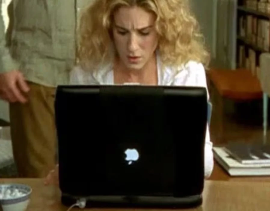
The change reflected Apple’s growing awareness that laptops were not only personal tools but also cultural objects. In cafés, classrooms, offices and conferences, the glowing Apple logo became part of the product’s identity. The computer was being seen not only by the person using it, but by everyone around it.
Jobs understood that design is not limited to functionality. It also shapes perception, ritual and desire. The orientation of a logo may seem minor, but in Apple’s ecosystem, even minor details communicate hierarchy, intention and discipline.
The decision also reveals a broader principle of brand architecture. A product does not exist only when it is being operated. It exists when it is carried, opened, displayed and recognized. Apple turned that visibility into one of its most powerful forms of silent advertising.

The lesson is clear: great design often hides inside decisions that most users barely notice. A rotated logo did not improve processing speed, battery life or screen quality. But it changed how the machine appeared in the social imagination.
In the Apple universe, even the direction of a symbol became part of the company’s language of control.
La narrativa también es poder. / Narrative is power too.